Data Overload? Visualize Insights in Minutes

Drowning in Data? Use These Visualization Tools to Uncover Key Insights in Under 30 Minutes equips you with the strategies and tools to quickly transform overwhelming data sets into actionable insights, saving time and improving decision-making.
Are you Drowning in Data? Use These Visualization Tools to Uncover Key Insights in Under 30 Minutes? In today’s fast-paced world, massive amounts of data are being generated every second. But having data isn’t enough; you need to be able to quickly understand it and extract meaningful insights.
Turning Data Overload into Actionable Insights
We live in an era of unprecedented data availability. From market trends to customer behavior, the information is there, but sifting through it can feel like an impossible task. Data visualization tools offer a lifeline, helping you to distill complex information into easily digestible formats.
This article will explore how these tools can transform your relationship with data, allowing you to uncover key insights in under 30 minutes.
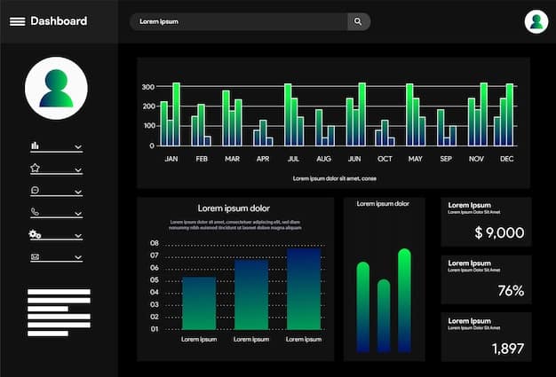
The Power of Visual Data Representation
Visualizing data reduces cognitive load and makes it easier to spot trends, outliers, and correlations that might be missed in raw data tables. Understanding these advantages is the first step towards mastering data analysis.
- Enhanced Comprehension: Visuals are processed faster than text, allowing for quick understanding of complex data sets.
- Identifying Trends: Patterns become obvious when data is displayed graphically, revealing trends and anomalies.
- Improved Decision-Making: Clear insights lead to more informed and effective decision-making processes.
Why Data Visualization Matters
Data visualization isn’t just about making pretty charts; it’s a strategic tool that enables businesses and individuals to make better decisions based on facts rather than gut feelings.
Top Data Visualization Tools for Quick Insights
The market is brimming with data visualization tools, each with its own strengths and specialties. Choosing the right tool is crucial for efficient data analysis and clear communication of findings.
Let’s explore some top contenders that can help you conquer your data challenges.
Tableau: A Leader in Interactive Visualizations
Tableau is a robust platform known for its ability to create interactive dashboards and visualizations. It’s a favorite among data analysts for its user-friendly interface and advanced analytical capabilities.
With Tableau, transforming complex datasets into compelling visuals is straightforward, allowing you to explore data from multiple angles.
Power BI: Microsoft’s Answer to Data Visualization
Power BI is Microsoft’s data visualization and business intelligence tool. It integrates seamlessly with other Microsoft products and is known for its affordability and accessibility.
Its drag-and-drop interface makes it easy to create reports and dashboards, even for those with limited technical expertise. Power BI also offers excellent data connectivity options, enabling you to pull data from various sources.
Google Data Studio: Free and Collaborative Visualization
Google Data Studio is a free tool that allows you to create interactive dashboards and reports. It’s particularly useful for teams that collaborate frequently, as it integrates seamlessly with other Google products like Google Analytics and Google Sheets.
Its accessibility and ease of use make it a great choice for small businesses and individuals looking to get started with data visualization.

Step-by-Step Guide: Uncovering Insights in Under 30 Minutes
Now that we’ve looked at some top tools, let’s dive into a practical guide on how to use them to extract insights quickly. The goal is to transform raw data into actionable knowledge in less than 30 minutes.
Follow these steps to streamline your data analysis process.
Step 1: Define Your Objective
Start by clearly defining what you want to learn from your data. Are you trying to identify sales trends, understand customer demographics, or optimize marketing campaigns?
Having a clear objective will guide your analysis and ensure that you focus on the most relevant data.
Step 2: Data Preparation and Cleaning
Before you can visualize your data, you need to ensure it’s clean and properly formatted. This may involve removing duplicates, correcting errors, and standardizing data formats.
Most data visualization tools offer built-in data cleaning features to help streamline this process.
Step 3: Choose the Right Visualizations
Selecting the right chart type is crucial for effectively communicating your insights. Different chart types are suited for different types of data and analytical goals. Also, consider what story you are trying to tell, and adjust accordingly.
- Bar Charts: Ideal for comparing values across different categories.
- Line Graphs: Best for showing trends over time.
- Pie Charts: Useful for displaying proportions of a whole.
Step 4: Interactive Exploration and Analysis
Data visualization tools allow you to interact with your data, filter it, and drill down into specific segments. Use these features to explore your data from different angles and uncover hidden patterns.
Interactive dashboards make it easy to answer ad-hoc questions and gain a deeper understanding of your data.
Step 5: Share and Collaborate
Once you’ve extracted meaningful insights, share your findings with stakeholders. Most data visualization tools offer options for exporting reports, embedding dashboards, and collaborating with team members.
Sharing your insights can lead to more informed decision-making across your organization.
Advanced Techniques for Data Visualization
To take your data visualization skills to the next level, consider incorporating some advanced techniques. Although these may take additional time investment initially, they can drastically improve the clarity and impact of your insights.
Here are some advanced techniques to help you get started.
Geospatial Analysis
If your data includes location information, consider using geospatial analysis techniques to visualize data on maps. This can reveal geographic trends and patterns that might be missed in other types of visualizations. It’s essential to know if your data is something that should be represented in such a way.
Tools like Tableau and Power BI offer built-in mapping capabilities that make it easy to create interactive maps.
Sentiment Analysis
Sentiment analysis involves using natural language processing (NLP) techniques to analyze text data and determine the sentiment expressed in it. This can be useful for understanding customer feedback, social media sentiment, and brand perception.
Combine sentiment analysis with data visualization to create reports that highlight trends in sentiment over time.
Forecasting
Data visualization tools can be used to create forecasts based on historical data. This can help you predict future trends and make more informed decisions about resource allocation and strategic planning.
Tools like Power BI offer advanced forecasting features that make it easy to create predictive models.
Best Practices for Effective Data Visualization
Creating effective data visualizations requires not only technical skills but also an understanding of design principles and communication strategies. Some rules you should consider are color choice, font pairing and overall look.
Here are some best practices to help you create visualizations that are both informative and visually appealing.
Keep It Simple
Avoid clutter and focus on the most important information. Use clear labels. Don’t use more data than necessary and be mindful of choosing colors that provide a good view.
If your visualization is too complex, it will be difficult for viewers to understand the message you’re trying to convey.
Choose the Right Colors
Use color strategically to highlight key insights and create a visually appealing design. Avoid using too many colors, as this can be distracting and make it difficult to interpret the data. Be mindful of colorblind viewers, and have accessible modes.
Consider using color palettes that are designed for data visualization to ensure that your visualizations are accessible and easy to understand.
Tell a Story
Data visualization is not just about presenting facts; it’s about telling a story. Use visuals to guide your viewers through the data and highlight the most important insights. Be certain that the story you’re telling remains accurate and truthful.
Add context and annotations to your visualizations to help viewers understand the significance of the data.
The Future of Data Visualization
The field of data visualization is constantly evolving, with new tools and techniques emerging all the time. Staying up-to-date with the latest trends can help you leverage the power of data visualization to gain a competitive advantage.
Here are some trends to watch out for in the coming years.
AI-Powered Visualization
Artificial intelligence (AI) is being integrated into data visualization tools to automate tasks, generate insights, and improve the overall user experience. When applied successfully, it can elevate the outputted data results.
AI can be used to automatically identify patterns in data, suggest the best chart types for visualization, and provide personalized recommendations to users.
Augmented Reality Visualization
Augmented reality (AR) is being used to overlay data visualizations onto the real world, allowing users to interact with data in a more immersive and intuitive way. It can be used to overlay statistical data on real-life objects.
This can be particularly useful for fields like urban planning, construction, and retail, where data is often tied to physical locations.
Embedded Analytics
Embedded analytics involves integrating data visualization tools directly into business applications, allowing users to access insights without having to switch between different systems.
This can improve productivity and make it easier for users to make data-driven decisions in their daily workflows.
| Key Point | Brief Description |
|---|---|
| 📊 Data Visualization | Transforms data into understandable visuals. |
| ⏱️ Time Efficiency | Quickly extracts insights reducing analysis time. |
| 🎯 Decision Making | Improves accuracy and speed in strategic decisions. |
| 🛠️ Tool Selection | Choose tools like Tableau, Power BI, Google Data Studio. |
FAQ
▼
Data visualization tools provide enhanced comprehension of complex datasets, quicker identification of trends and outliers, and improved decision-making based on clear insights.
▼
Consider your budget, data sources, and technical expertise. Tableau offers advanced features, Power BI integrates seamlessly with Microsoft products, and Google Data Studio is free and collaborative.
▼
Keep visualizations simple and clear, select suitable colors, tell a story with the data, and ensure that the visualizations effectively communicate insights to the intended audience.
▼
Advanced techniques like geospatial analysis, sentiment analysis, and forecasting allow for deeper insights by incorporating geographical data, analyzing emotions in text, and predicting future trends.
▼
The future includes AI-powered automation, augmented reality for immersive experiences, and embedded analytics for real-time insights within business applications, making visualizations more accessible and insightful.
Conclusion
In a world overflowing with data, visualization tools offer a crucial means of distilling complex information into actionable insights. By choosing the right tools and techniques, you can transform data overload into a strategic advantage, enabling faster and more informed decision-making.


